Track: A Look Back

Whether an interesting statistic, or a requirement of your business, the Timecard function can tell you where you’re spending your time and capture the distance traveled.
Topics
Analyzing Time
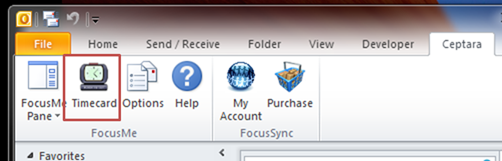
The Timecard dialog is launched from the Ceptara explorer ribbon:
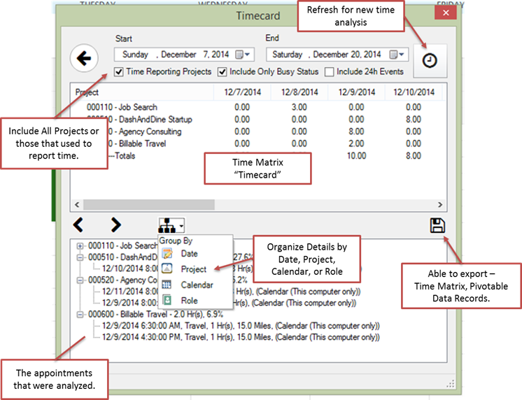
The dialog presents time spent for a series of dates as described by the Start and End date dropdown controls. The projects are presented down the left side of the time list box, and each day in the range is a column that shows time spent by project with a total at the end of the column and a total at the end of each row. If the dates are changed, the user presses the ‘Clock’ button at the top of the dialog to refresh the time calculations.
Analyzing Time via the
Timecard
Additionally, in the Details window, the appointments that have been analyzed can be displayed by project, date, calendar or role. This can be useful if the hours spent for each day or each project require further scrutiny. Additionally, if there are several calendars, e.g. professional and personal, the time can be differentiated by calendar. The Role detail supports the measuring time for each role that you play, e.g. you can check your goal for “spending more time with the family” by totaling up the time spent in the Father (Mother) and Spouse roles.
Data Export
The data can be exported for use with other programs such as Microsoft Excel or a company’s ERP system. There are two formats available: a) Time Matrix, which is the same format as what is rendered in the Time Analysis Matrix view, and b) Pivot-able Data Records, which can be useful in Excel in supporting pivot analysis. If there other, more specific, formats of interest, e.g. JD Edwards or SAP, please contact us to add your format.
Time Matrix
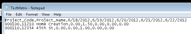
The Time Matrix data is exported in a CSV format (comma separated values) and is in the same form as presented in the list view in the Timecard dialog, e.g.
Time Tracking, Matrix
Export (Comma Separated Values, CSV)
The first row represents the column names, i.e. Project_Code, Project_Name, [each date in the analysis represents a separate column]. Each subsequent row would contain the calculated data. A CSV file can be opened using Microsoft Excel or any program able to parse CSV data.
Pivot-able Data
In order for Microsoft Excel to ‘pivot’ data, the best format to use is one you might see in a database table.
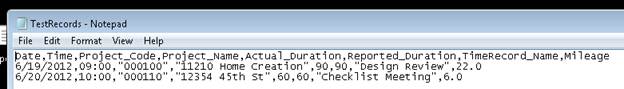
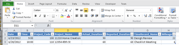
Time Tracking, Records
Export (Comma Separated Values, CSV)
The first row represents the columns names and each subsequent row represents a time record (appointment).
Pivot-able Data – Columns
· RecordDate: the date and time associated with the time record (the appointment).
· WeekEndingDate: the date and time associated with the ending of the week (facilitates week ending pivot analysis).
· Code: the code of the project the appointment was categorized to.
· ProjectName: the name of the project associated with the appointment.
· Duration (minutes): the duration of the appointment, i.e. the different between when the appointment began and when it ended, represented in minutes.
· DurationHrs (Hours): the duration of the appointment specified in hours (real numbers)
· ReportedDurationHrs (Hours): the duration calculated for the appointment using the timecard interval specified in the Options. Often the ‘Duration’ and ‘ReportedDuration’ will be the same, however, in some cases it could vary. For example if an appointment had an actual duratnoi of 48 minutes, and the interval was set to 0.25 hours, then the reported duration would be 1.0 hour bcause the 48 minutes duration will be rounded up to the next interval’s increment
·
Subject: the subject of the
appointment item as stored in Outlook.
· Mileage: some appointments have travel associated with it, in that case, a distance statistic may be used to track how far was traveled to complete the appointment. The number will either be in miles or kilometers, depending on the user’s preference.
· CalendarName: if multiple calendars are used the name of the calendar from which the appointment was found will be listed.
· RoleName: the role assigned to the appointment, if present.
Using the data example above, it could look like the following in Microsoft Excel after importing and formatted into an Excel table:
Time Tracking, MS Excel
Data Table
Let’s say we want to view the total reported time spent by day for each project. After saving the file as a Microsoft Excel file, we could then pivot the data by using the Insert tab to insert a Pivot Table that uses our newly created table as its source:

Time Tracking, Data
Analysis – time spent by day in each project
The analysis is very similar to what is presented natively in the tool. So, big deal, I got that before.
Let’s change our question a bit – we will now report miles traveled by project for each day:
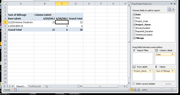
By simply changing the “Values” field, we can analyze the mileage instead of the reported duration. This specific analysis could be useful for reporting mileage on an expense form for reimbursement, or perhaps for filing taxes.
The ability to ‘pivot data’ is very powerful and can be used for a wide variety of analyses. The Organizer’s ability to export using records can enhance your ability to track and review what is most important to you.
Metrics and Charts
There are two main presentation windows for metrics, the Task Pane charts, and a selected Project’s Window Home tab.
Dashboard
The top pane in the task pane contains a number of metrics. The size of the task pane dictates the number of metrics presented. The user can set the way the metrics are presented, e.g. include the metric name or micro-chart or both.
Task Pane Charts
The middle pane in the task pane contains a number of charts, included:
· Workflow: shows the active tasks organized by their status, e.g. No Category, Scheduled, In Progress, Waiting, Partial, Deferred, and Past Due. No category represents tasks that do not have a project assigned to them. Partial represents tasks that have percent complete greater than zero but less than 100%.
· Time Spent: Presents the unadjusted time by project in a pie chart in the specified time window.
· Billings: Calculates the time spent multiplied times the rate (per hour) as recorded in the project properties, and presents a pie chart arranged by project in the specified time window.
· Completed Tasks: Presents the number of completed tasks per day in the specified time window.
· Project Task Pareto: Shows the projects with the most overdue tasks in Pareto [1] order.
· Project Risk: Calculates a project risk index and presents the most risky project in Pareto order. Includes factors such as # of overdue tasks, ability to complete work in the pipeline, and on-time task completion.
· Distance Traveled: Shows the number of miles or kilometers traveled by project in the specified time window.
· Unread Emails: Presents the number of unread emails in all Inboxes in the specified time window.
The content of the charts is controlled by the top tab filtering. For example, if the Home tab (in the top tab) is selected, then the charts will present data for all projects – as they are shown in the bottom list view when the bottom tab’s Home tab is selected. If a specific project is of interest, then selecting that project via the top tab will refresh the selected chart for that project’s data only.
[1]: Pareto is a frequency chart (like a histogram) that arranges the counts in highest to lowest order.
Home Page Charts
When the project is opened, a series of charts are shown on the Home tab. The charts for the project are the same charts in the Task Pane charts except they are calculated for the selected project.
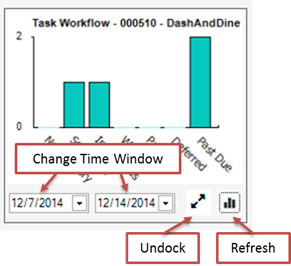
Metric Mini-Chart
Each chart can be modified by selecting a different time window and then selecting the Refresh button. If the chart ‘undocked’, then a separate window is created for the chart:

Metric Undocked Chart
The chart can then be manipulated for a different time window or time period (if applicable). The mechanism for summarizing the data (i.e. the function) can be changed, i.e. sum, average, product, etc. Or a different metric can be selected and analyzed.
Metric Undocked Chart
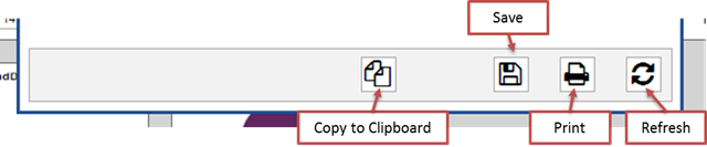
Button Bar
The chart can be saved to an image file using the Save button. It can be printed or copied to the clipboard to be pasted into another report or file. The chart can be refreshed when the time window, period, function or metric has been changed.
Copyright (c) Ceptara Corp.